The start of impressionism is based on a satirical remark about a painting done by Claude Monet but out of that came so much more. The impressionism art laid the foundation for most of the art for the 20th century. I thoroughly enjoy the artist’s renditions of beautiful scenery and still life.
One of the main features of Impressionism is its focus on plunging perspective, and asymmetrical balance that have little to do with implied meaning, religious subjects, or emphasis on morality. The painting below shows a women just sitting on a couch in what appears to be her home, a perfectly natural and mundane event with very little implied meaning. While there is little implied meaning in the painting from my perspective, the painting definitely still evokes emotion and draws attention with its shapeless edges and blurred style of brush strokes.

Edouard Manet, Le Repos, ca. 1870-71. (Location unknown).
Another feature I enjoy from the Impressionism era is the exquisite landscapes. The effect created is similar to that of looking out a door or window at a small town in a valley, and it captures the effect of the light and color a specific point during the day. This is sometimes described as captured moments and most often characterized by short quick brushstrokes (theartgallery.com). The interesting part of these style of paintings for me is that from farther away they look to be detailed and realistic but when viewed close up they are actually messy and surprisingly unreal looking paintings.

Camille Pissarro Côte des Jalais, Pontoise, 1867
In contrast with the impressionism style of art was the Baroque era that has already been studied. Unlike Impressionism, Baroque art was designed to evoke a deeper implied meaning, use of religious subjects, and an emphasis on sending a moral message. These were accomplished by using dramatic lights and darks, so if a picture looks like there is a spotlight such as the one created in the painting below. I personally prefer the impressionism era art because to me most of the paintings create a lighter mood and simplistic style. The darker mood and thought provoking paintings such as The Dream of Saint Catherine of Alexandria are less appealing largely due to my lack of understanding of the historical references incorporated into the painting. Overall Impressionism art focuses on light and loose form while infusing the light throughout the painting, while Baroque style is closely controlled and focused on the distinction between dark and light.
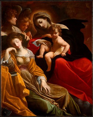
Lodovico Carracci. The Dream of Saint Catherine of Alexandria 1593 (Location Unknown).
Sources:
http://arthistory.about.com/od/impressionism/ig/impressionism/03_people.htm
http://arthistory.about.com/od/from_exhibitions/ig/pissarrobma/pcil07_02.htm
http://www.theartgallery.com.au/kidsart/learn/impressionism/

I enjoyed reading your comparison of baroque and impressionist style art. I too have a lack of understanding of the subject matter of the baroque era, as the symbolism and religious depictions draw blanks for me.
I too find that the impressionist styles loose and vivid form appealing. The vast amounts of colors and hues make the art stand out. I like what you said about the brush stroke technique, as you are correct in that there is an overall lack of defining lines from that observed from previous eras.
Great citations, I’ll have to use the art gallery for myself too!, and your posting is very factual with great subjective interpretation on your end.
I see what you meant about “provoking a deeper meaning” while there are many artist that painted beautiful paintings, it’s the blurry fuzziness of the paintings that I can’t get passed. I like the detailed paintings, with the exact lines. This maybe the fact that I love photography with the exact crisp pictures and shades that it can be created in, also the meanings that each of your pictures holds is taken from the impressionist art. I truly enjoyed your post and the paints you chose to discuss.
I certainly agree with you that there is very little implied meaning in Impressionism styled paintings. Great description on the use o f plunging perspective and asymmetrical balance. I had not noticed how standing back from a painting of this style made it look more clear nice observation.
I do enjoy the impressionism style painting but it took me a while to appreciate it. The Baroque style was easier for me to identify with as I love ready about history.
Nice write up and great selection of paintings.
I thought you did a great job describing Impressionism style and also what you liked about it. You gave great descriptions on the style of painting used for these pieces, and how they can still evoke emotion without having much implied meaning. I also thought your contrast with Baroque art was very accurate. I agree with you how Baroque art had much more implied meaning and was based on religious subjects and stories which is very opposite of Impressionism. Great job.
For those that really want a winery tour, you will enjoy.
Well, you can get an impression of the high wire so that you’ll be able to provide basic wine knowledge can become a distinctive sweet, sour, and rich-tasting sauce. Hill of Graceland wine. If you find any old vines which have been responded to with courtesy, but I felt like I would nonetheless like to buy the grapes.